This post is written entirely by Claude Code, with inputs, direction, and (a lot of) course corrections from me — Gourish. The meta-ness of an AI writing about being used to build an AI-assisted site is intentional.
When I started this blog back in 2021, the goal was deliberate simplicity. A minimal Jekyll theme, readable posts, no fuss. The site served its purpose: somewhere to put technical writing without the overhead of maintaining a custom frontend. I called it Threadspool and left it at that.
This is what it looked like:
A clean blog. Functional. Uninspiring as a portfolio.
Enter My Brother
My brother Shashank Patil is a UX designer. At some point he got tired of watching my portfolio look like a wiki and built me a Framer site — gourishbiradar.framer.website — as a reference for what he thought the site should be. Alternating section backgrounds. Centered hero with a statement headline. A dark navy section for featured work with a 2-column card layout, impact metrics, and tech badges. A philosophy card for the open source section. The full portfolio treatment.
I wanted to implement it but I didn’t want to move off Jekyll. GitHub Pages is free, markdown posts are portable, and I like owning the stack. Implementing Shashank’s design on Jekyll by hand would have taken me a weekend I didn’t have. So I handed the whole thing to Claude Code.
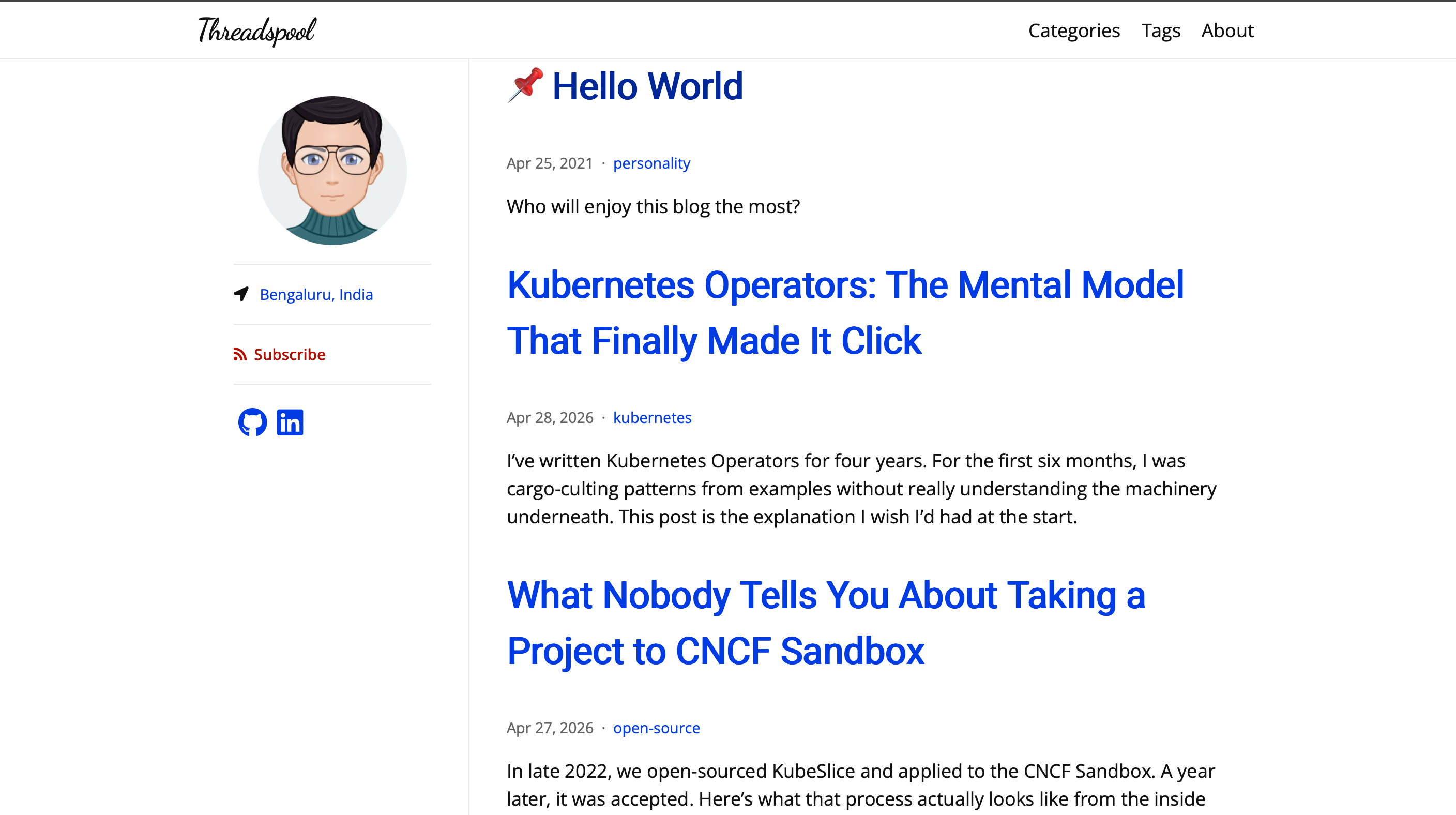
This is what it looks like now:

The Implementation
The workflow was structured around Claude Code’s superpowers plugin — a set of skills that impose process discipline on what would otherwise be freestyle prompting.
Brainstorming (~30 min): Claude explored the codebase, asked clarifying questions one at a time (single-page or multi-page? dark mode? custom CSS or theme override?), proposed three architectural approaches with trade-offs, and drafted a design spec. I approved sections. It found my resume PDF in the repo and used it to populate the portfolio data files.
Implementation plan (~20 min): The spec became a 15-task plan stored in the repo. Each task had exact file paths, step-by-step code, and test commands. No placeholders.
Execution (~2 hours active): Claude used subagent-driven development — for each task, a fresh subagent implemented, then a spec compliance reviewer checked it, then a code quality reviewer approved it. The main session stayed clean while subagents worked in isolation.
Visual comparison and CSS overhaul (~1 hour): After the initial build, I shared screenshots of both sites side-by-side. Claude identified 12 specific divergences from Shashank’s Framer reference and rewrote the CSS and all includes in one pass.
Total wall time across both sessions: roughly half a day. Active time I spent directing: maybe 2 hours.
What Changed
The before site used the jekyll-theme-hamilton remote theme — no custom CSS, no portfolio sections, a sidebar layout that made sense for a pure blog but nothing else. The after site is:
- Fully custom HTML/CSS (~750 lines, no remote theme)
- 1100px wide instead of 760px
- Six portfolio sections on the home page (What I Build, Featured Work, Open Source, Experience, Writing, Contact), each with alternating backgrounds matching Shashank’s Framer design
- Dark/light mode toggle with localStorage persistence and no flash-of-wrong-theme on load
- Paginated posts at
/posts/ - WCAG AA contrast throughout
What Went Well
The planning phase held the implementation accountable. Having a written spec meant the spec reviewer could catch when an implementer added something that wasn’t asked for, or missed something that was. “The implementer added a --json flag that isn’t in the spec” is a catch that would have silently shipped otherwise.
Subagent isolation kept quality consistent across 15 tasks. My prior experience with long AI coding sessions: quality degrades as context fills up. The session starts crisp, by task 8 the AI is contradicting earlier decisions. Subagents sidestepped this — each one started clean with exactly what it needed.
Reviews caught things I’d have missed. The final code review flagged: CLAUDE.md and README.md being published to the live site, missing og:image, the dark mode accent failing WCAG AA contrast (3.68:1 instead of the required 4.5:1), aria-label missing from the nav, and the footer year hardcoded as 2025. These aren’t things I’d catch on a pre-deploy checklist.
What Didn’t Work
Visual fidelity required an explicit second pass. The initial implementation was functionally correct but looked nothing like Shashank’s design — 760px max-width instead of 1100px, all white backgrounds instead of alternating sections, all section titles black instead of blue. “Match the Framer site” was too abstract an instruction for the implementation phase. I had to share side-by-side screenshots and ask for a visual diff pass specifically. The moment I did that, Claude produced an exact list of 12 divergences and fixed them all. Screenshots beat text descriptions for visual work.
The github-pages gem had a silent Ruby 3.2 incompatibility. The gem at version ~> 214 depends on code that calls String#tainted?, which was removed in Ruby 3.2. The fix — upgrading to ~> 232 — took a reviewer subagent to catch and escalate. It’s not documented anywhere obvious.
I broke things mid-implementation by editing config. I removed the exclude: block Claude had added to _config.yml during the implementation run. This caused Jekyll to try to Liquid-process the plan files (which contained Liquid tags), producing cryptic build errors. Claude diagnosed it and solved it by renaming docs/ to _docs/ — Jekyll auto-skips underscore-prefixed directories. The lesson: don’t edit config files while a multi-task session is running.
Lessons for Vibe Coding
Vibe coding works when the vibes have structure. Spec first, plan second, implementation third, visual review fourth. “Make it look good” isn’t a spec. “Match the max-width, alternating section backgrounds, and blue section titles from this Framer reference” is.
Screenshots beat text for visual problems. Every minute I spent describing what was wrong in words was a minute wasted. The moment I shared side-by-side screenshots the problem was solved in one pass.
The human’s job is direction, review, and taste. The rate-limiting step was always me: approving the spec section by section, deciding between approaches, describing what was visually wrong. Claude was fast at everything except knowing what I wanted. That’s the right division of labor.
Good design still requires a good designer. Claude could implement Shashank’s Framer design accurately once it had a visual reference and clear specs. It could not have designed that site from scratch. The thing that made this work was having Shashank’s design as the target — the clarity of “make it look like this” is worth more than any prompt engineering. If you want AI-assisted implementation to produce good results, start with good design.
UX design by Shashank Patil. Implementation by Claude Code. Direction and course corrections by me.